PinnedKelly GedvilasinBootcamp2020: The year of interviewsThe summer of 2020 I set out to make a change in my career. With the pandemic beginning earlier that year, I was forced to sit with my…Feb 27, 2021Feb 27, 2021
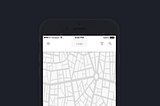
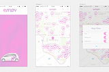
Kelly GedvilasWireframe Challenge meets InVisionSo, here it is… Here is the wireframe (from previous post) in motion:May 15, 20181May 15, 20181
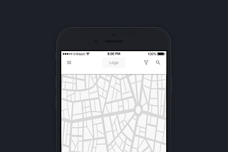
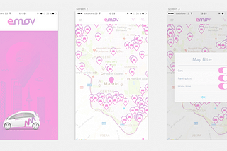
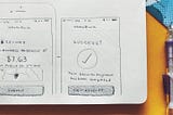
Kelly GedvilasWireframe ChallengeFor this challenge, we were to take existing app screens and produce what the wireframe would have looked like in Sketch. I enjoyed this…May 15, 20182May 15, 20182
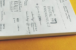
Kelly GedvilasThe Value on Sketch-notingOn How Giant Websites Design For YouApr 28, 20183Apr 28, 20183